Map Projections: A Beginner’s Guide
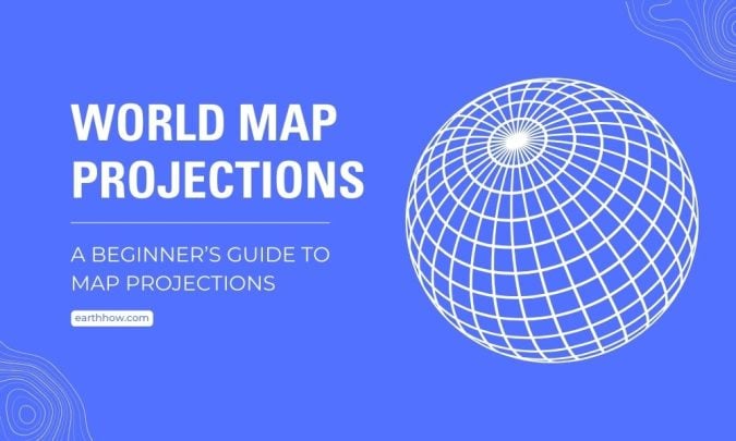
Maps flatten the Earth. That’s tricky because the Earth is round. So, map makers use map projections to help. Each type uniquely shows the globe. In this beginner’s guide, you’ll learn about map projections.
Developable Surfaces
How do you show a 3D globe on a flat piece of paper? You use developable surfaces. Developable surfaces can be unfolded without stretching or tearing.
For example, cylinders and cones are common choices. Because of this, they help us turn the round Earth into flat maps. Each shape gives us a different map projection.
1. Cylindrical Map Projections
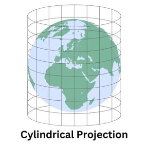
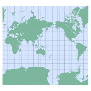
Cylindrical map projections wrap the globe in a cylinder and project the Earth’s surface onto a flat piece of paper. Latitude and longitude lines form a grid of rectangles. Because of this, these maps are easy to read, especially for plotting courses over long distances.
However, they distort sizes and shapes near the poles. While the equator looks accurate, polar regions seem bigger than Africa, which isn’t true. As you move away from the equator, size distortion increases.
Despite the distortion, we use cylindrical projections in maritime navigation. This is because they preserve angles, making them useful for charting a straight-line course. Also, they’re pretty straightforward to construct and understand.
The Mercator Projection uses cylinders as developable surfaces
For example, the Mercator projection is a well-known cylindrical type. Ever notice how big Greenland looks on maps? That’s the Mercator effect. Greenland appears almost as large as Africa, despite being significantly smaller.
Then, why use the Mercator Projection at all? We use the Mercator projection because it keeps directions straight on the map. So, if you’re sailing, you can draw a straight line to plan your route.
In the end, while cylindrical projections are popular for navigation, they can mislead others. Especially, when representing the true size and shape of countries in polar regions.
2. Conic Map Projections
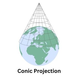
Conic map projections involve draping a cone over the Earth. This method focuses on a specific area, usually between two latitudes. They’re great for mapping continents and countries that stretch more east to west.
The cone touches the Earth at one or two lines of latitude. This touch point minimizes distortion there. So, these maps are pretty accurate around those lines. But, the further you go from these lines, the more distortion you see.
We often use conic projections for road and weather maps. This is because they balance size and shape well over these areas. They give a good view of mid-latitude countries, like the USA and China.
Albers Projection uses cones as developable surfaces
The Albers projection is popular for its accuracy in showing areas. This means it keeps the size of land masses correct. It’s perfect for showing regions where keeping the area true is important. For example, we use it in many atlases.
But remember, no map is perfect. Shapes can get a bit distorted, especially at the edges of the map. This can make countries look slightly bent or stretched. Also, it’s not the best for global maps because it focuses on accuracy over large areas, not the whole world.
So, while the Albers Projection is great for certain uses, it’s not a one-size-fits-all solution. One big advantage is how it shows large countries. The USA, for instance, looks well-proportioned, making it ideal for showing census data as a whole.
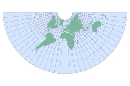
3. Azimuthal Map Projections
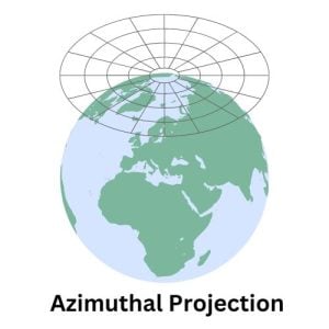
Azimuthal projections have a unique way of showing the Earth. They project the globe onto a flat surface from a single point. Imagine looking at the Earth from space and flattening what you see onto a page. These projections can center on any point, but often it’s the North or South Pole.
Azimuthal projections come in several types. Each type serves a different purpose. Some keep distances accurate, while others focus on direction or area. For example, we might see them in polar charts.
But, azimuthal projections aren’t great for everything. Distortion increases significantly at the edges. This means the shape and size of land masses can look very wrong if they’re far from the center.
Azimuthal Map Projection of the Northern Hemisphere
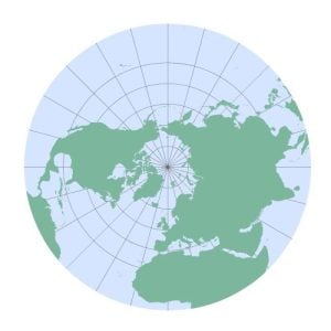
As mentioned before, one key advantage is their ability to accurately represent areas around the center point. This accuracy fades as you move away from the center. So, they’re perfect for focusing on one region of the globe.
For example, equidistant azimuthal projections keep distances true from the center to any other point. Another example is the Lambert azimuthal equal-area projection, which keeps the area consistent. We see these types of projections show the true size of land and ocean areas.
While these types of maps are unmatched for polar views, they come with limitations on global accuracy and edge distortion. Because they can’t show the whole world accurately, this limits their use of global maps.
Is there a realistic map of the world?
So far, we’ve explained cylinders, cones, and planes as developable surfaces. Some developable surfaces focus on keeping countries’ shapes right. Others care more about sizes. No map is perfect. Is there a realistic map of the world?
Yes. Surprisingly, there is a way to show the Earth without any distortion of shape, size, or angle. And that’s by showing the Earth as a globe. What’s the downside? You can only see one side at a time. And it’s not much of a map projection!
I just want to walk you through some of the other map projections that attempt to limit distortion. There are hundreds of map projections that you can choose from. So, which one should you pick?
The Compromise Projection
Compromise projections are a middle ground. They balance size, shape, and distance errors. No projection is perfect, but these try to reduce flaws.
The Robinson Projection
The Robinson projection is a good example. It shows the whole world. It makes the Earth look more natural, not too stretched or squished.
Winkel Tripel
Another one is the Winkel Tripel. National Geographic uses it. It combines the best of other types. It’s good for showing the whole planet.
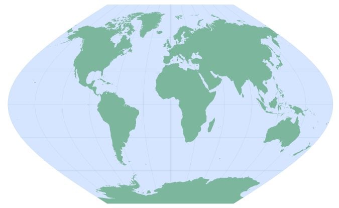
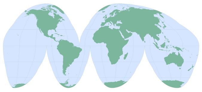
Goode’s Homolosine
Goode’s Homolosine projection is another example of a compromise projection. It splits the world into sections. This way, it minimizes distortion for both land masses and oceans.
These maps aren’t perfect for everything. But, they make global maps look nicer and more balanced.
A Beginner’s Guide to Map Projections
No matter how you slice and dice it, map projections have their distortions. Each type serves a purpose, whether for navigation, education, or planning.
Ultimately, choosing the right projection depends on your needs. But my one takeaway for you is that you should recognize that a perfect map doesn’t exist.